Image tips for Squarespace websites
This post may contain affiliate links. Please read full disclosure for more information.
Intro
Here are some important tips when it comes to designing your amazing website — how to properly add photos!
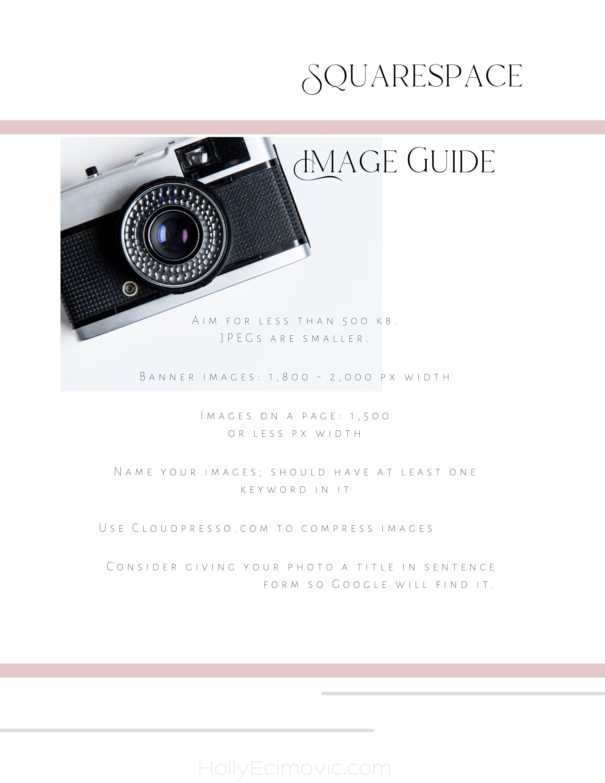
I created some charts below to help you with remembering what sizes to aim for, and what types of files to use. I also include info on where to find stock images. Check it out!
Related: How to find stock images for your website
Basic Photo Guidelines for Squarespace
When gathering your images to post on your website pages, you want to make sure the images are less than 500 kb. Remember, JPEGs are smaller than PNG files.
Here are links to places where you can compress your photos:
Banner images should be 1,800 - 2,000 px width. A banner image is the big picture you see when opening up a website.
Banner images should always be horizontal.
You also definitely want to consider that if you are putting text on top of a photo, you need to still be able to read the text. It helps then if that photo is more of a solid color, abstract, or if it is not very detailed or busy looking.
Regular images that are on a page should be 1,500 px width or less.
You should remember to name your images when you save them. Try to put at least one keyword in the name of the photo file you are saving.
You can use CloudPresso (above) to compress your files to make them smaller, if you need to.
Also, consider naming your photo file in sentence form, for example, “Best summer gardening tips.PNG” might be a photo file name.
One easy way to make your website look more professional is to use similar looking stock photos.
Ideally, you use images from either one photographer, or from one website, such as Unsplash or Canva.
The goal is to keep the overall look and feel of your website consistent. Don’t worry, it’s easier than it sounds! Less is more.
Shopping Page Image tips
By shopping pages, I mean the pages where you are featuring physical products you are selling.
For example, if you’re selling notebooks, you want to have very brightly lit, very clear images of those notebooks on the site, posted next to their prices and where people put them in their virtual shopping carts.
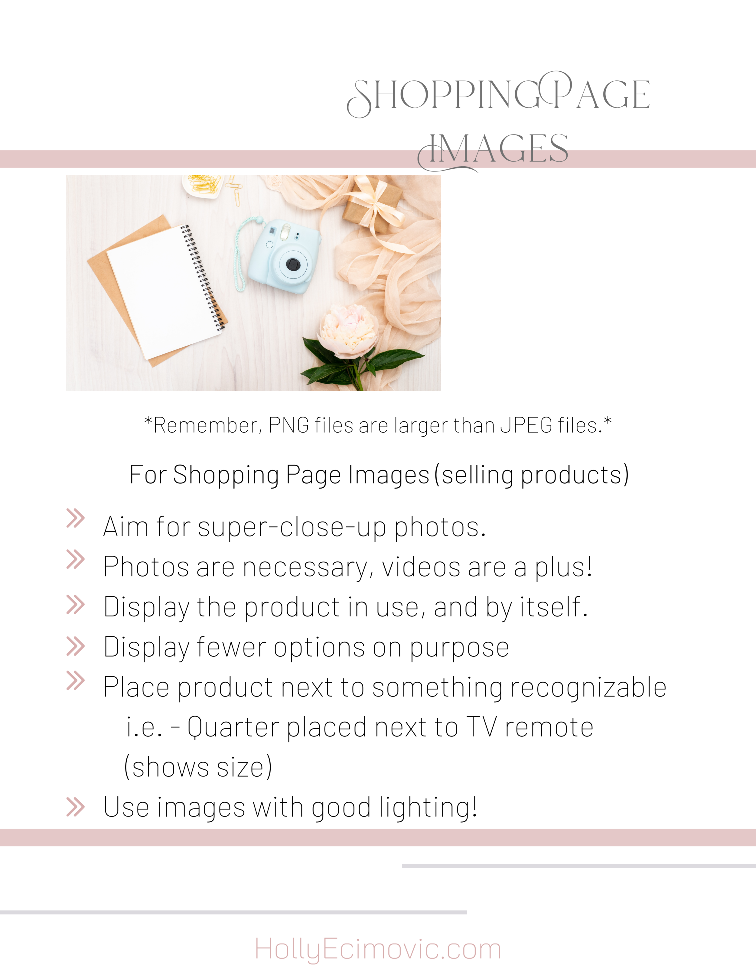
Here are some tips for posting images of your products you’re selling:
Aim for super close-up photos
Good lighting
Photos are necessary when selling products. Videos are extremely beneficial.
Display the product in use and by itself
Display fewer options on purpose so people don’t get overwhelmed
Place the product next to something recognizable. Example: Place a quarter next to a cell phone, for instance, to show how big the phone is
Use images that are good quality, not blurry
Helpful articles:
Re-sizing images in Squarespace
Formatting your images in Squarespace
See the charts below for visual reminders on image tips!
Looking to design your website today?
No problem!
Download your free Website Design Blueprint workbook, HERE.
Fill out this workbook, and then we can launch your website.
Send me a message at techsupport@hollyecimovic.com.


